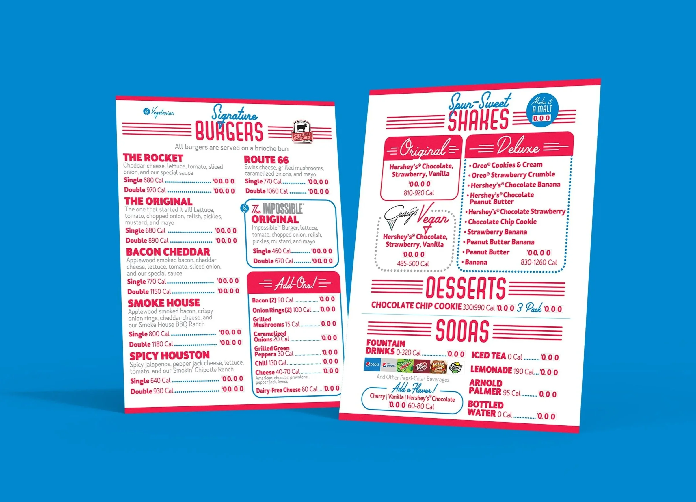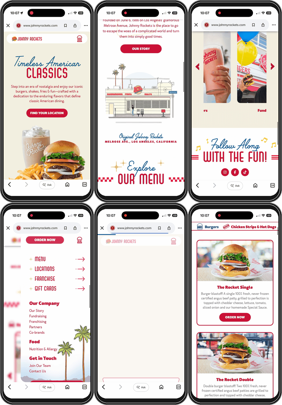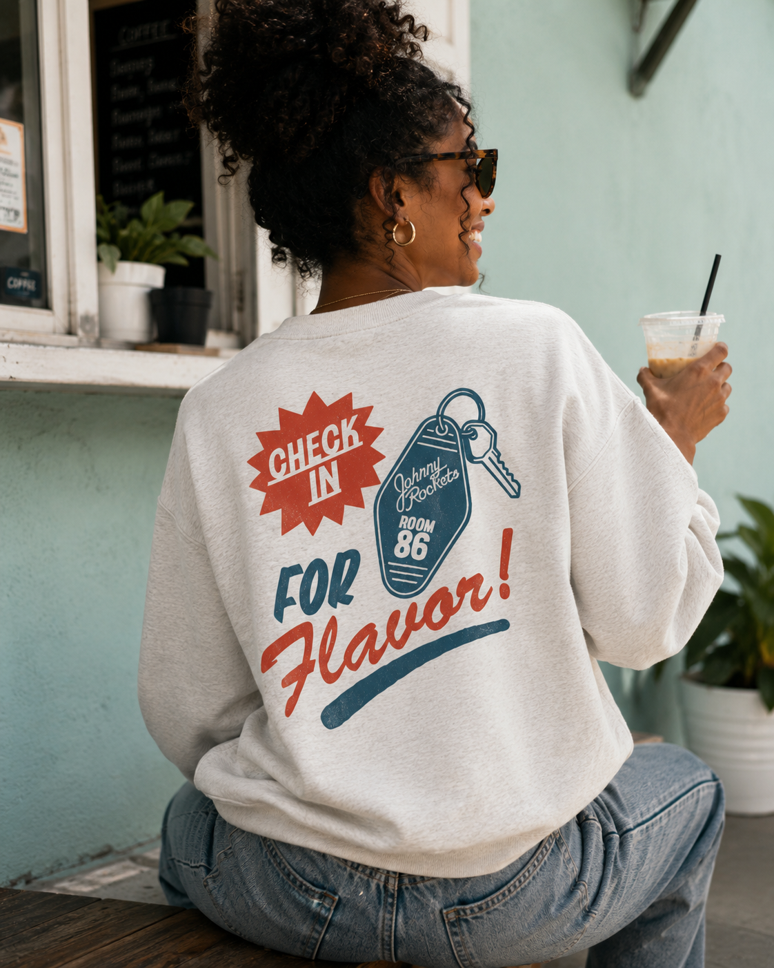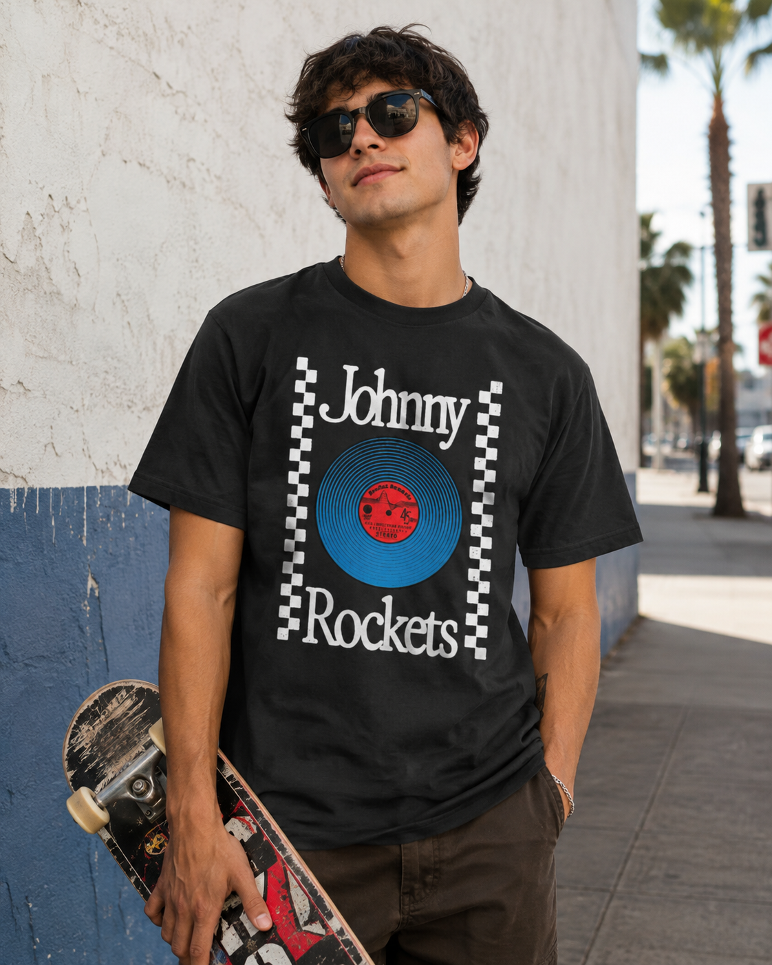
Client: Johnny Rockets
Initiative: Brand Identity Refresh
Role: Creative Direction, Art Direction, Illustration, Graphic Design
FAT Brands In-house Creative
-
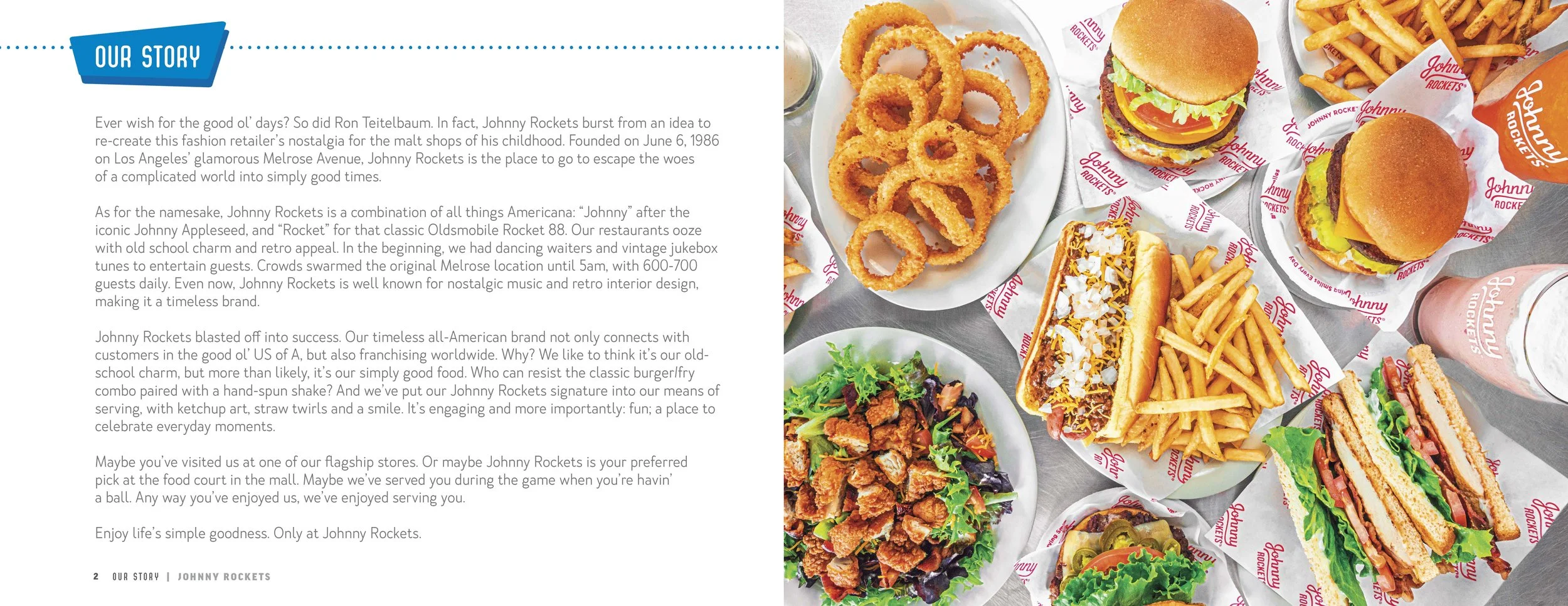
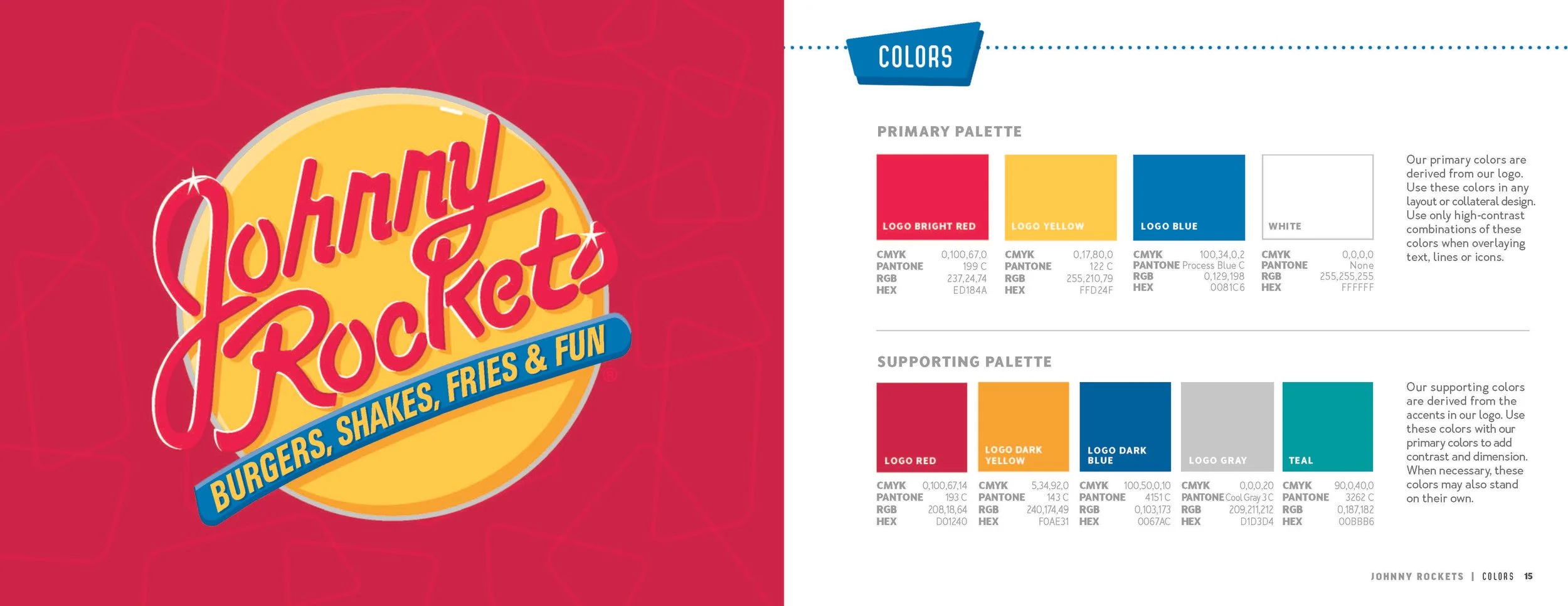
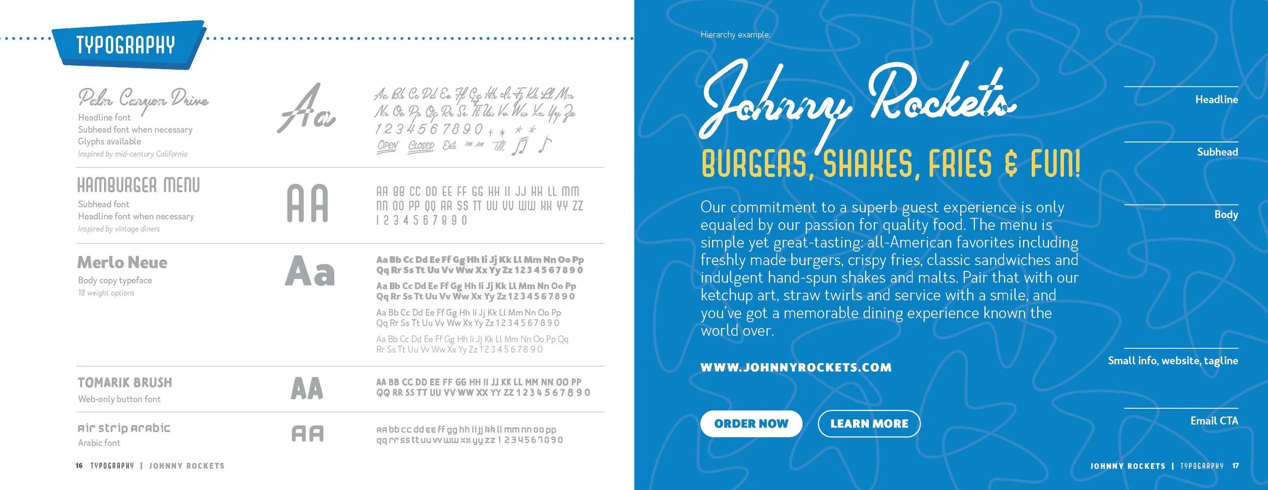
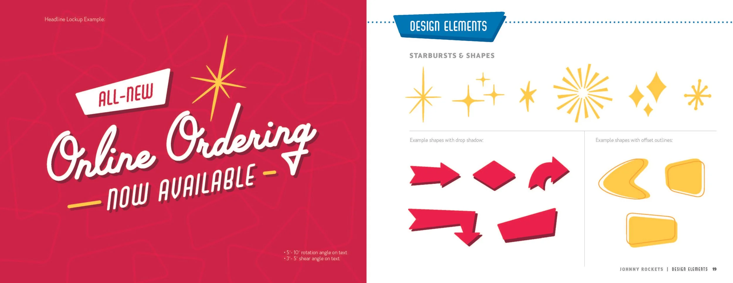
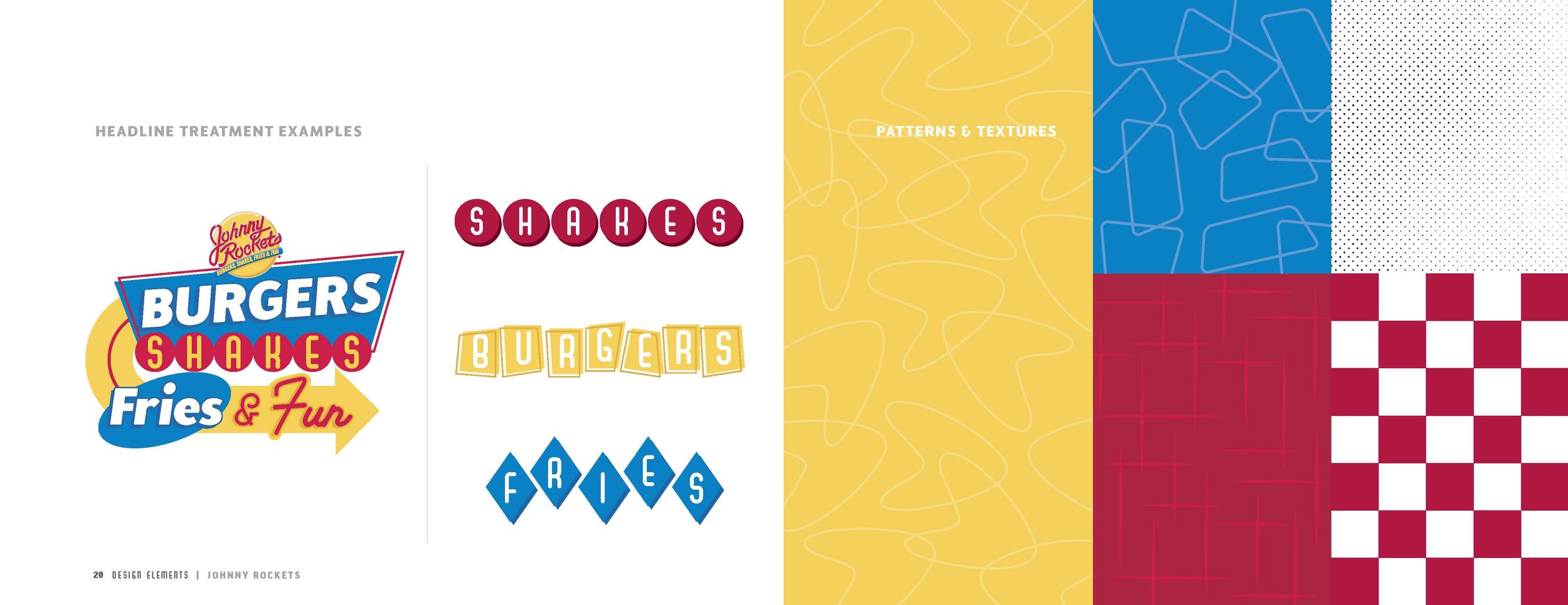
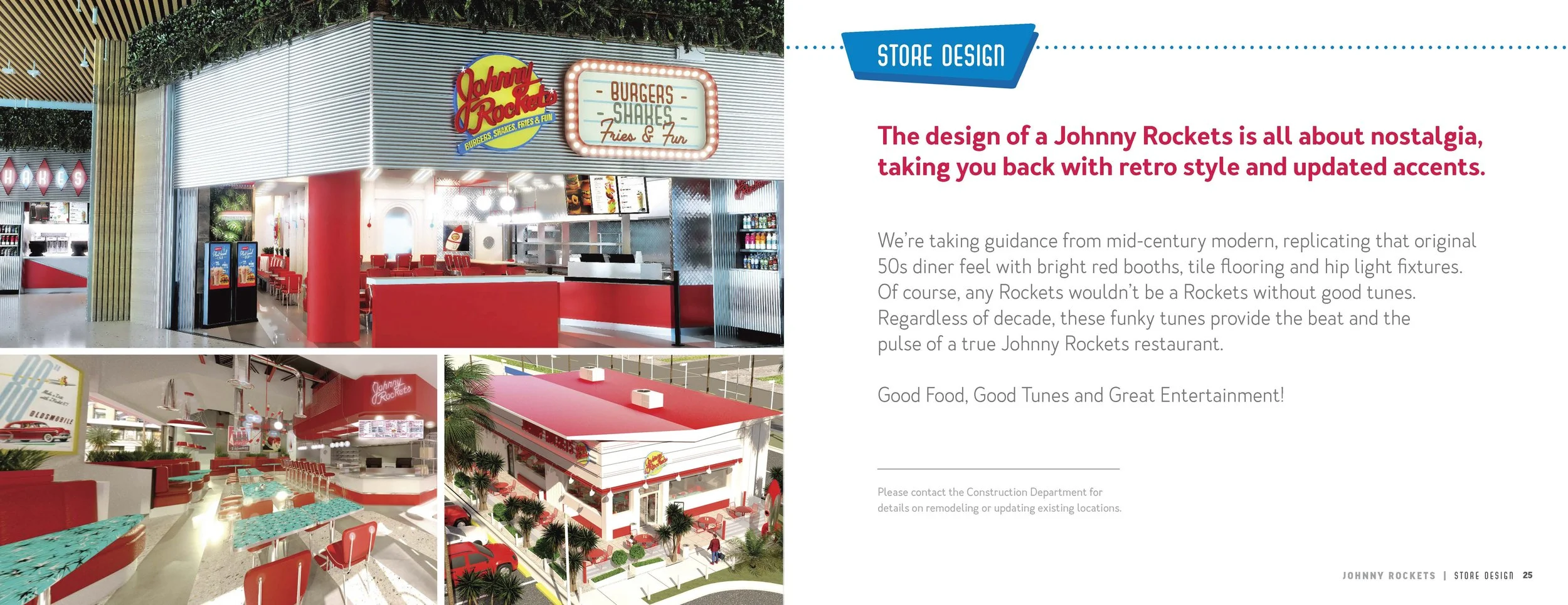
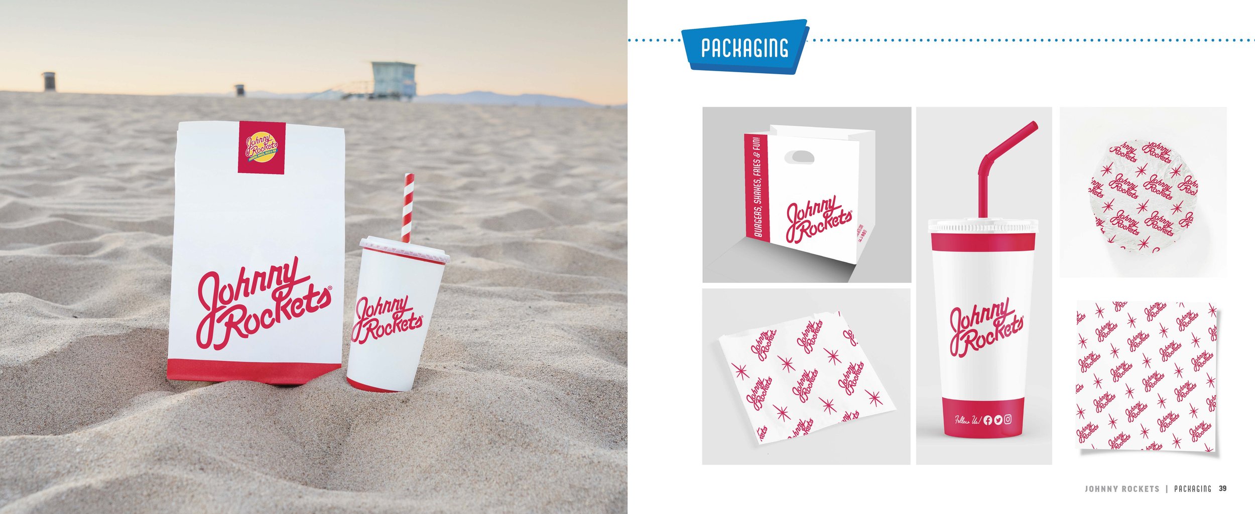
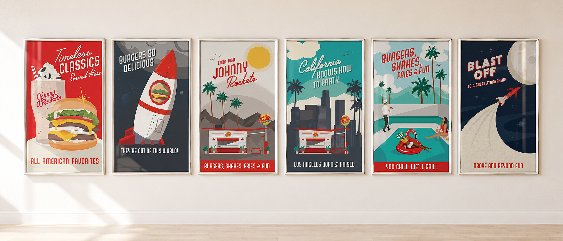
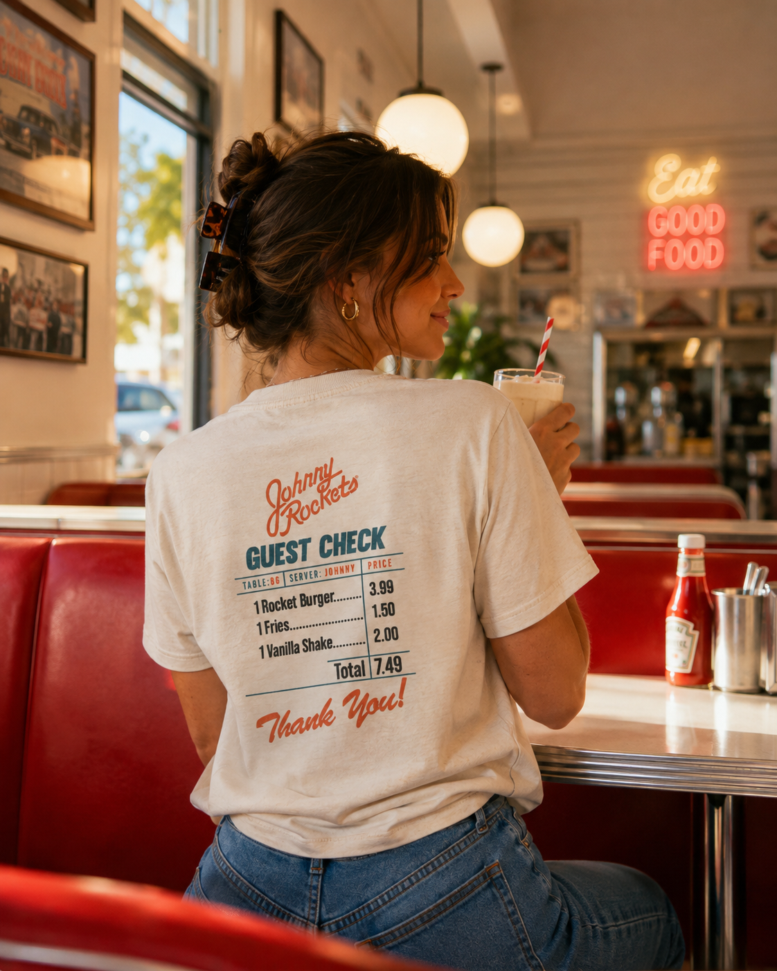
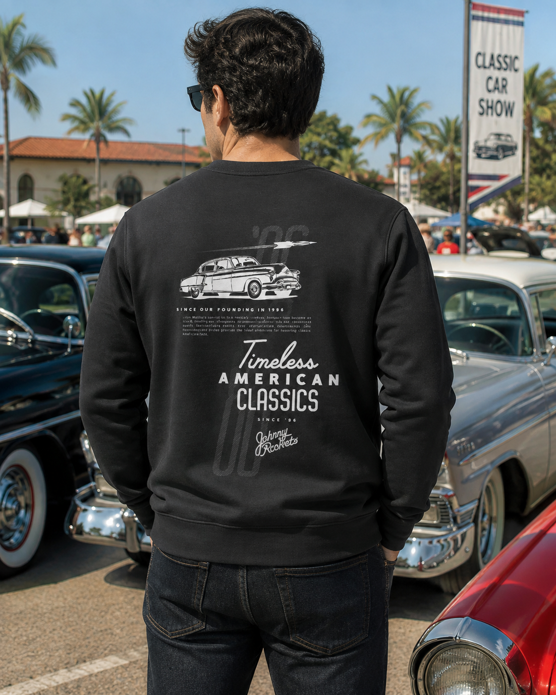
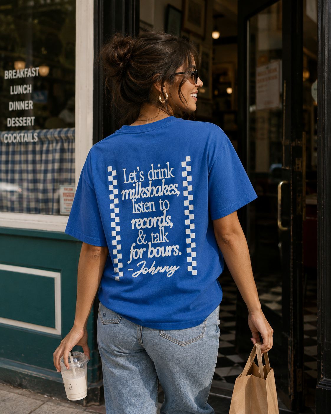
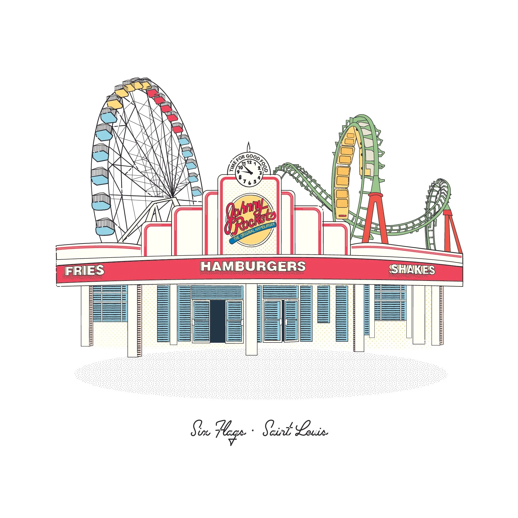
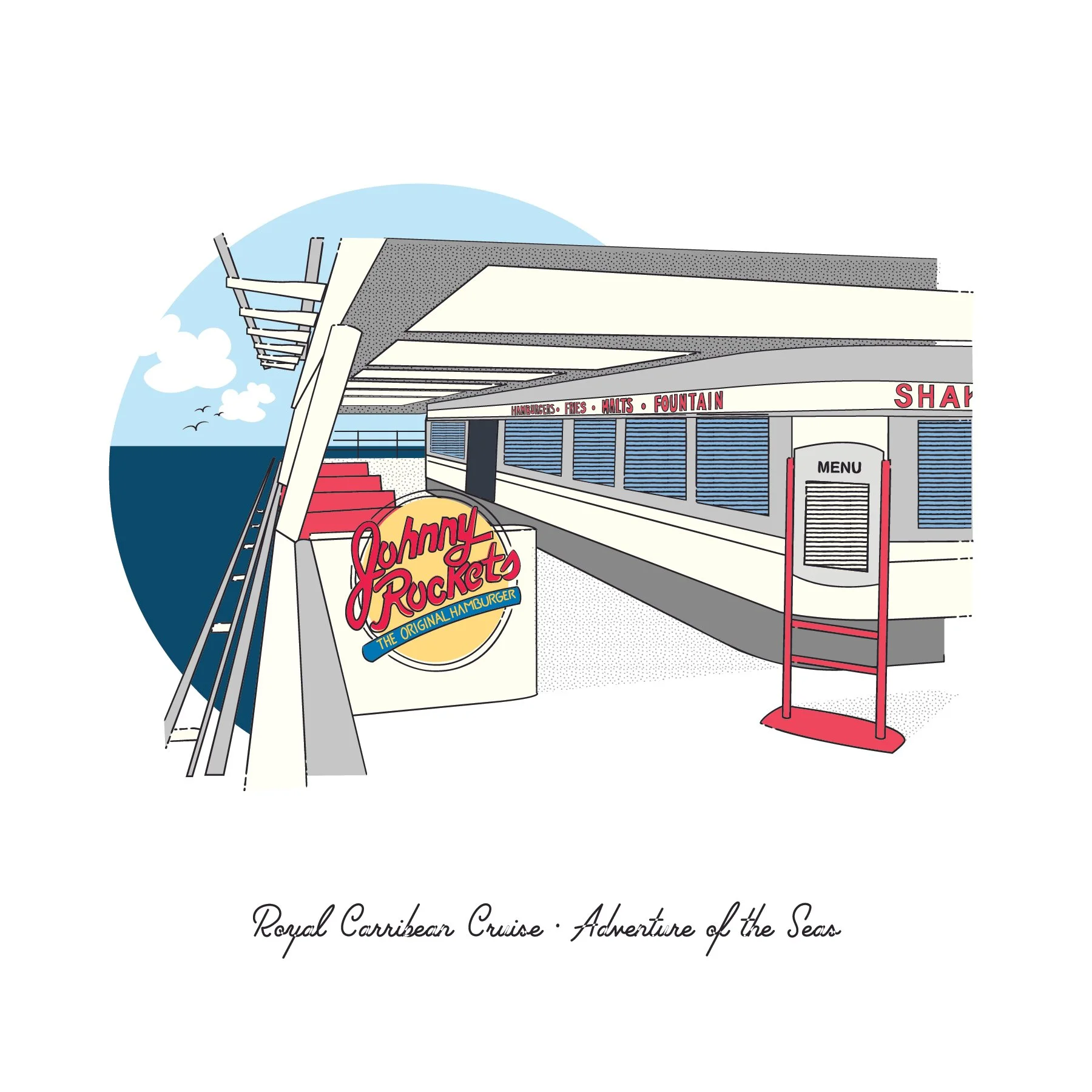
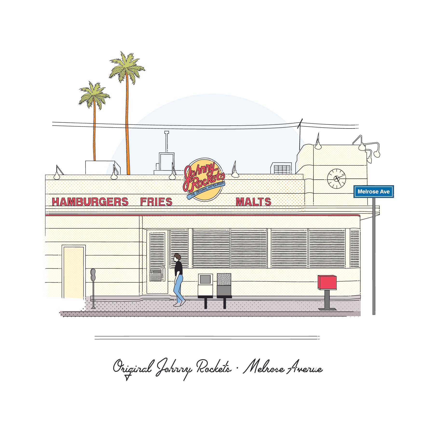
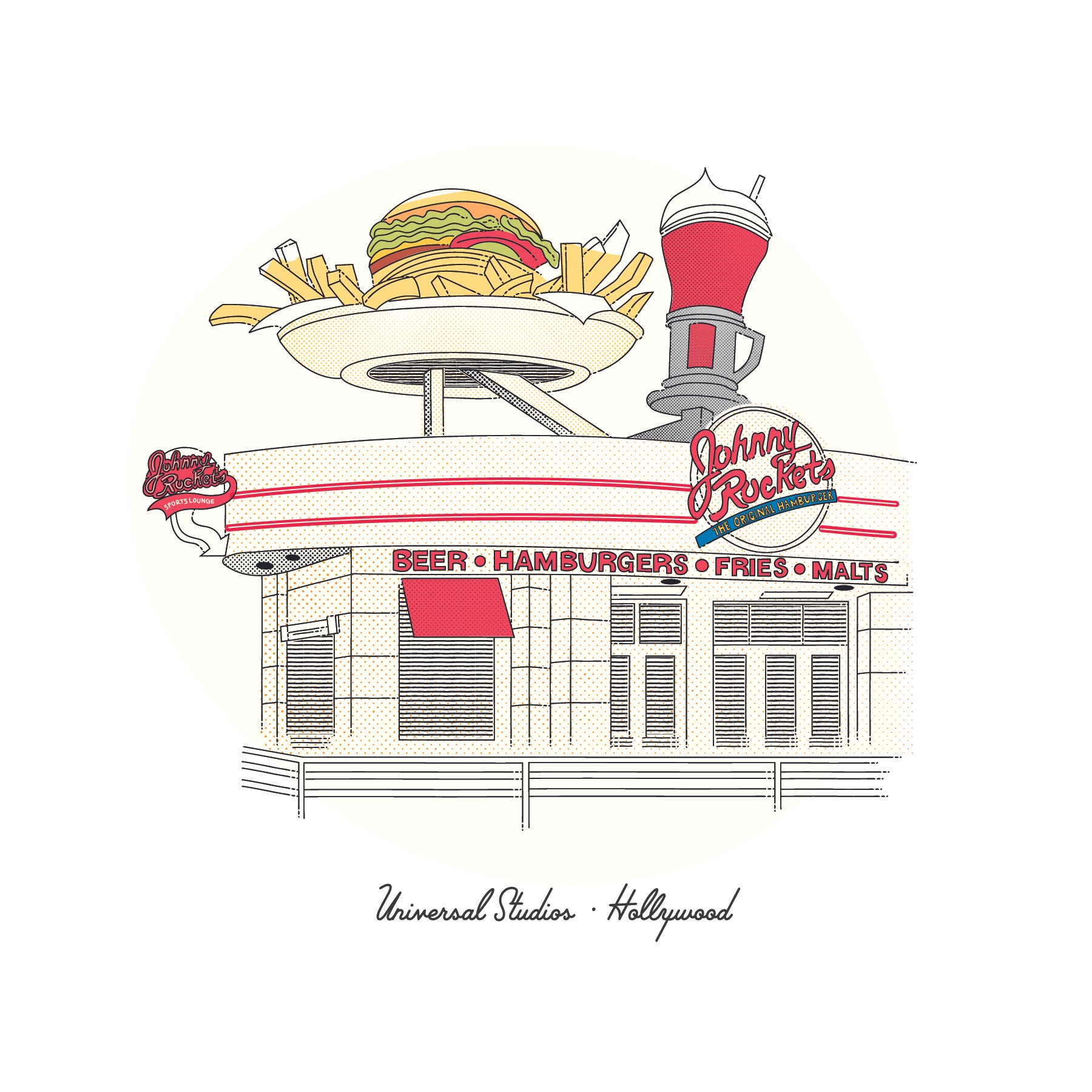
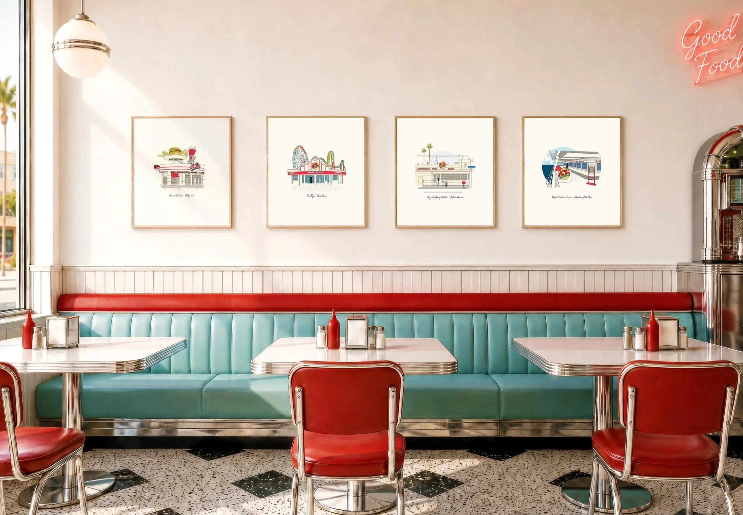
Johnny Rockets has decades of brand recognition and a strong association with classic Americana, but nostalgia alone isn’t enough to stay relevant with today’s consumer. The challenge was to modernize the expression of the brand without modernizing away what people love about it.
We set out to create a Johnny Rockets that could resonate with a new generation while maintaining it’s origins. We stripped back years of trends and attempts to modernize the brand and that was immediately recognizable to longtime guests—bringing its energy, personality and sense of nostalgia forward in a way that feels more confident, contemporary and culturally relevant.
-
We set out to break the mold and build an identity system as distinctive as Fazoli’s itself. Fast-food Italian is a category of one, so the brand needed to stop borrowing cues from traditional Italian restaurants or typical quick-service chains and start owning its own visual world. The result was a bold, playful system rooted in pasta-inspired graphics, vibrant food-forward color, expressive typography, energetic photography, and a witty, welcoming voice.
Every touchpoint from menus and digital to packaging and store design was designed to feel more engaging, memorable, and unmistakably Fazoli’s.