Client: Pretzelmaker
Initiative: Brand Identity - Rebrand
Role: Creative Direction, Art Direction, Illustration, Graphic Design
FAT Brands In-house Creative
-
Pretzelmaker has strong product recognition and nostalgia, but the brand needed a visual identity that felt as fresh, fun and craveable as the food itself. The goal of the rebrand was to create a more distinctive, energetic brand that can stand out in today’s crowded food and snack landscape.
We wanted to build a system that feels relevant to a new generation of guests while still celebrating what has always made Pretzelmaker special: warm, craveable products, playful indulgence and the simple joy of grabbing a great snack.
-
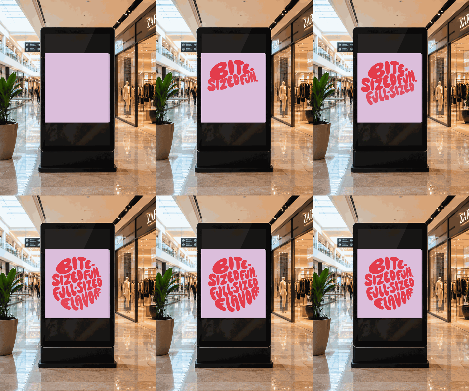
We leaned into the idea of “Bite-Sized Fun. Full-Sized Flavor” as both a brand promise and a creative lens.
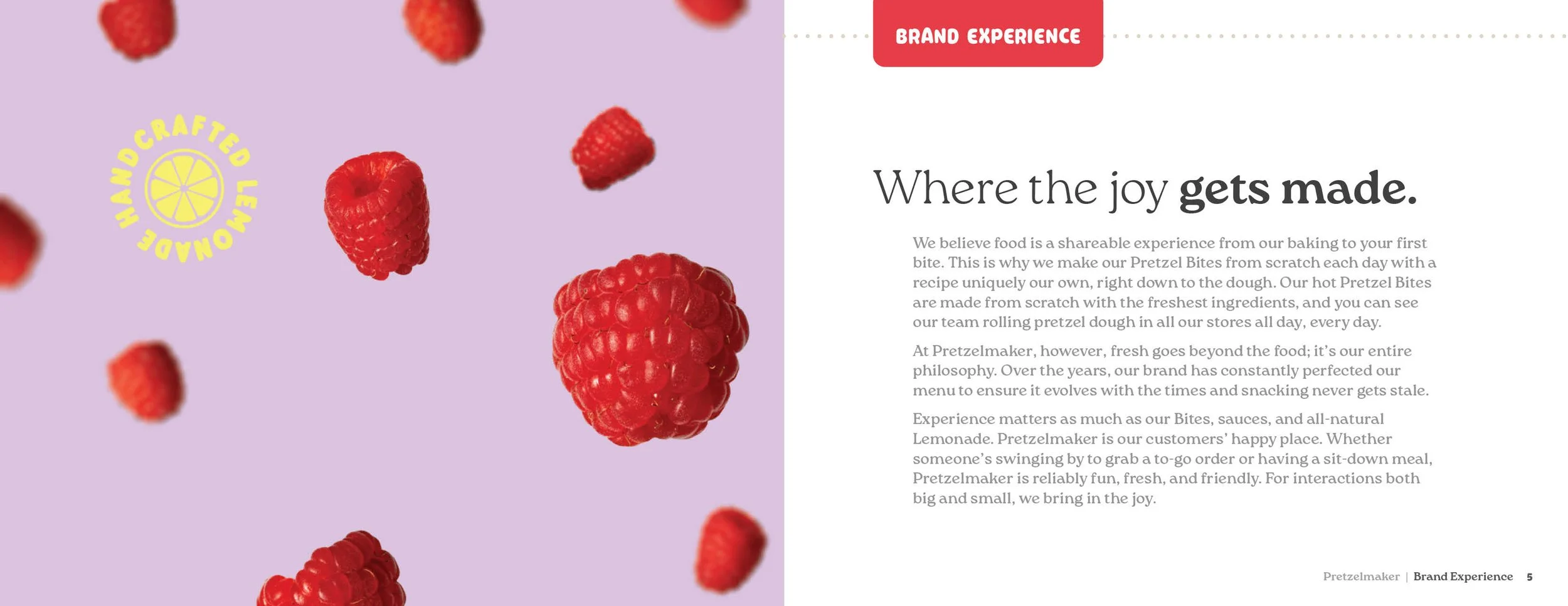
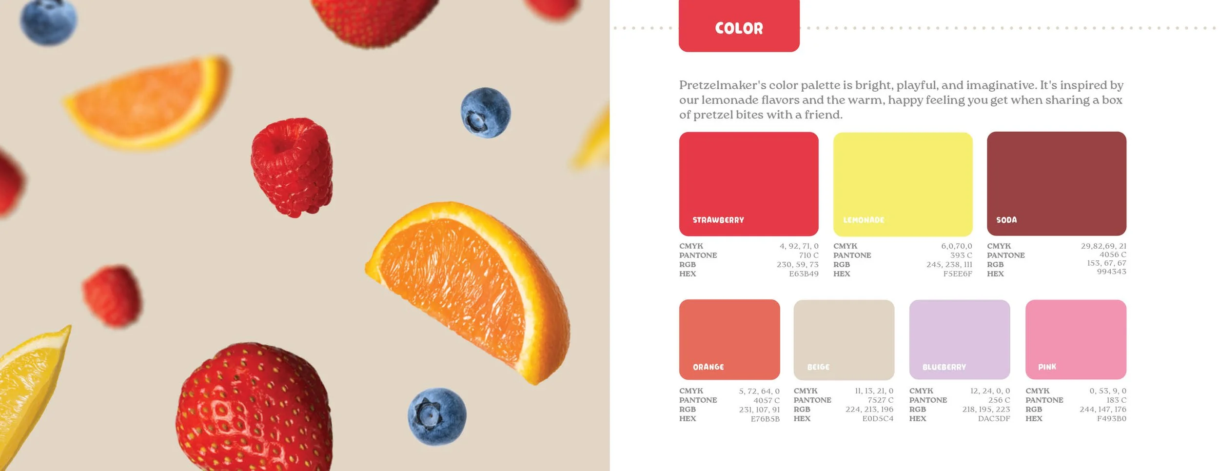
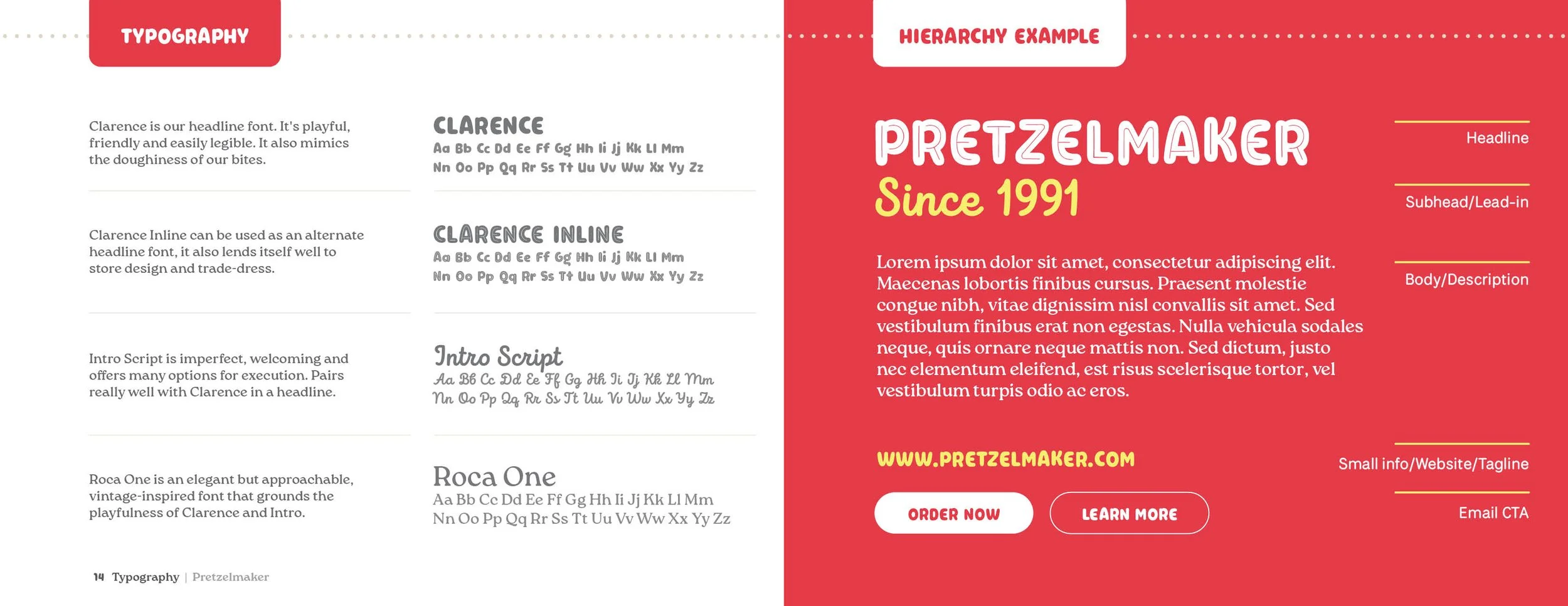
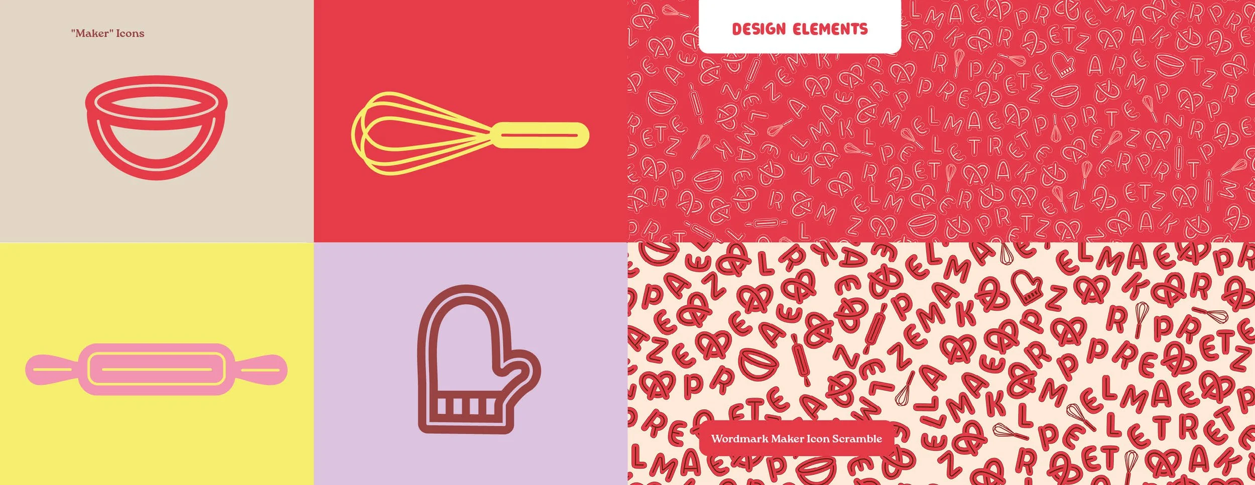
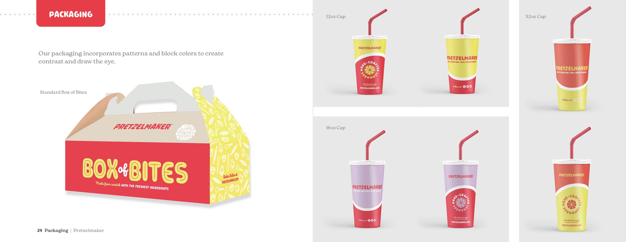
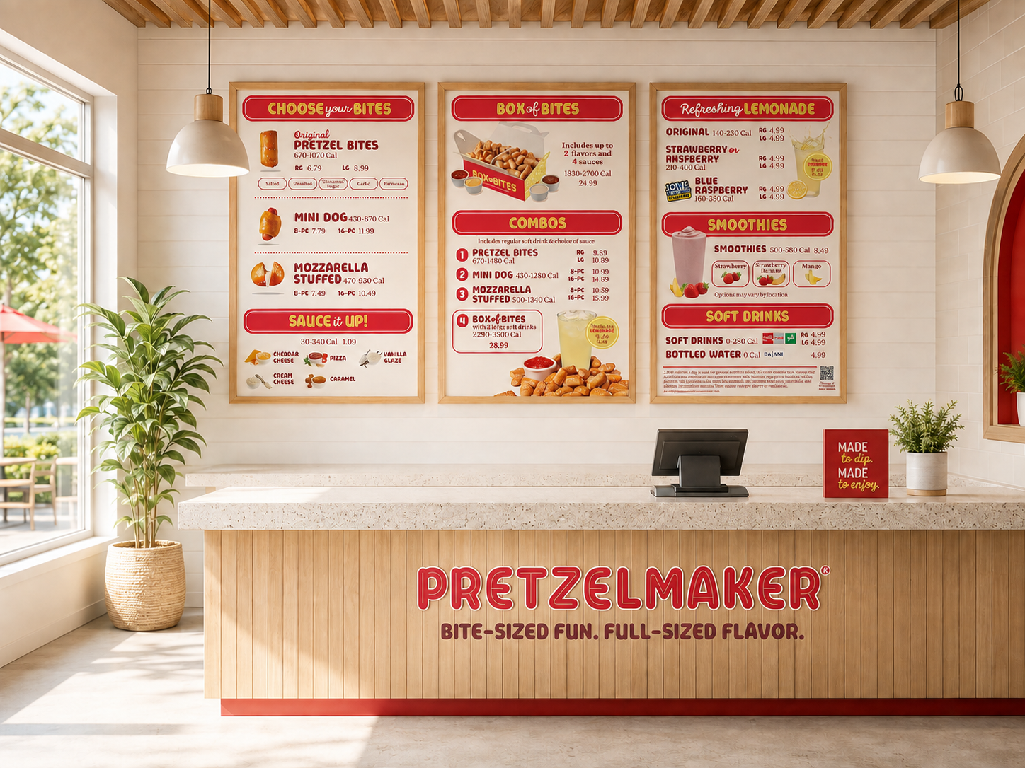
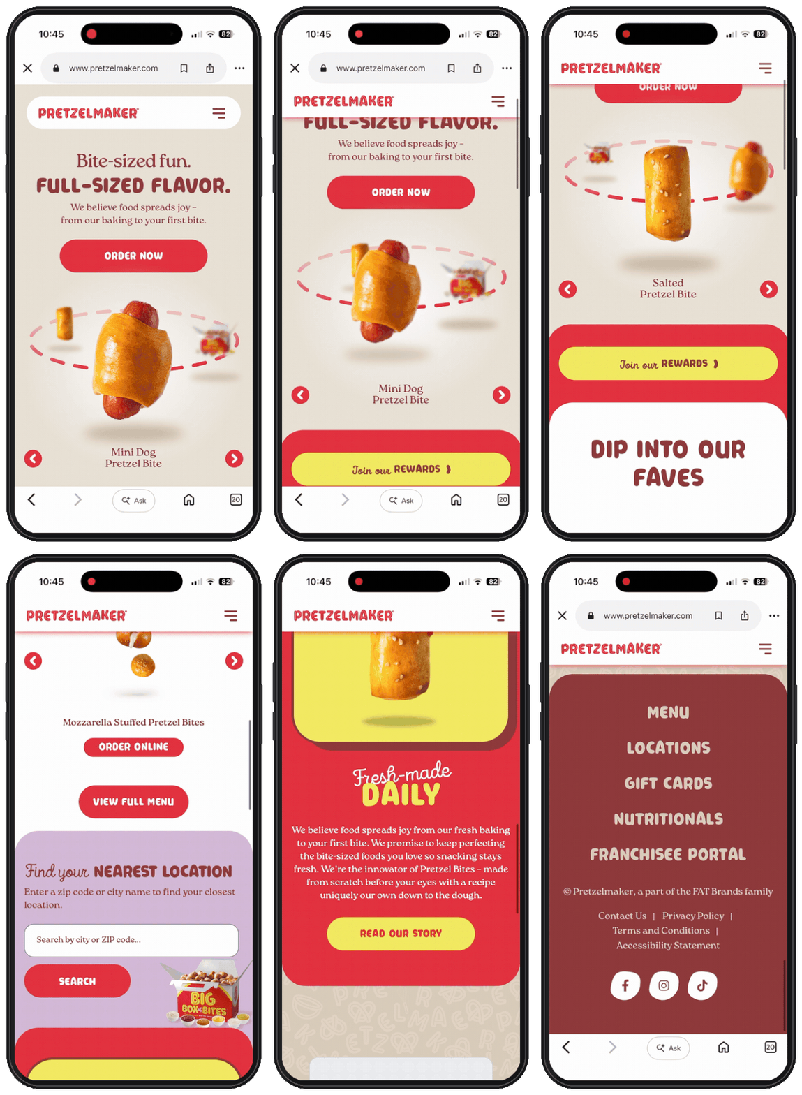
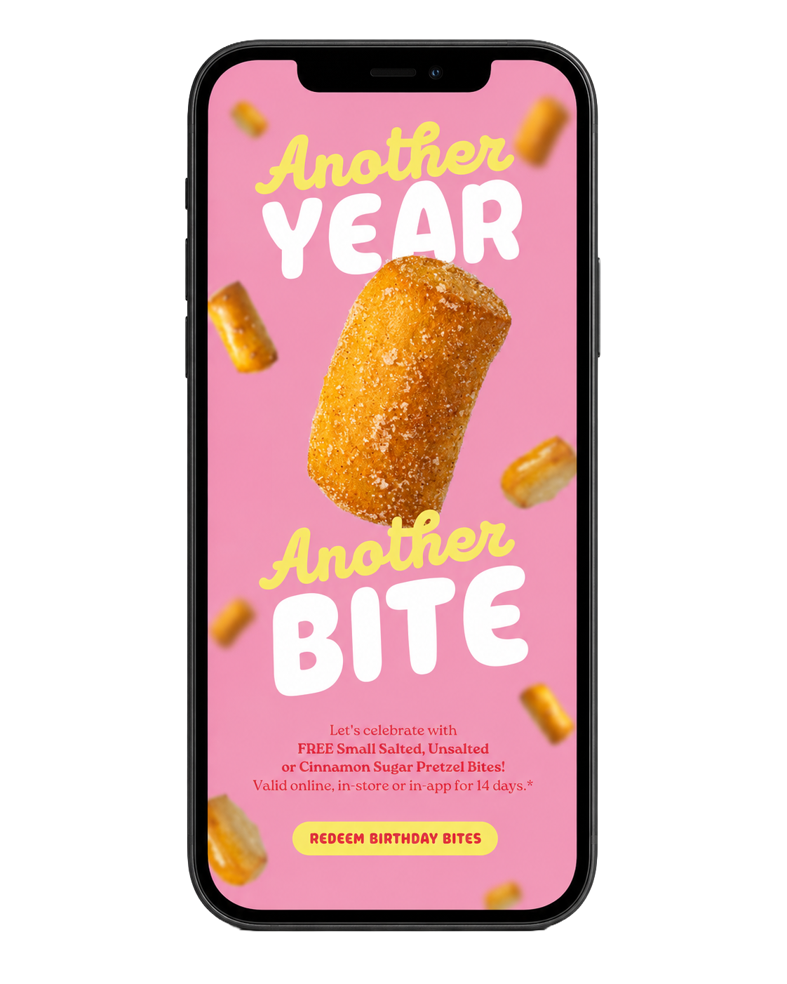
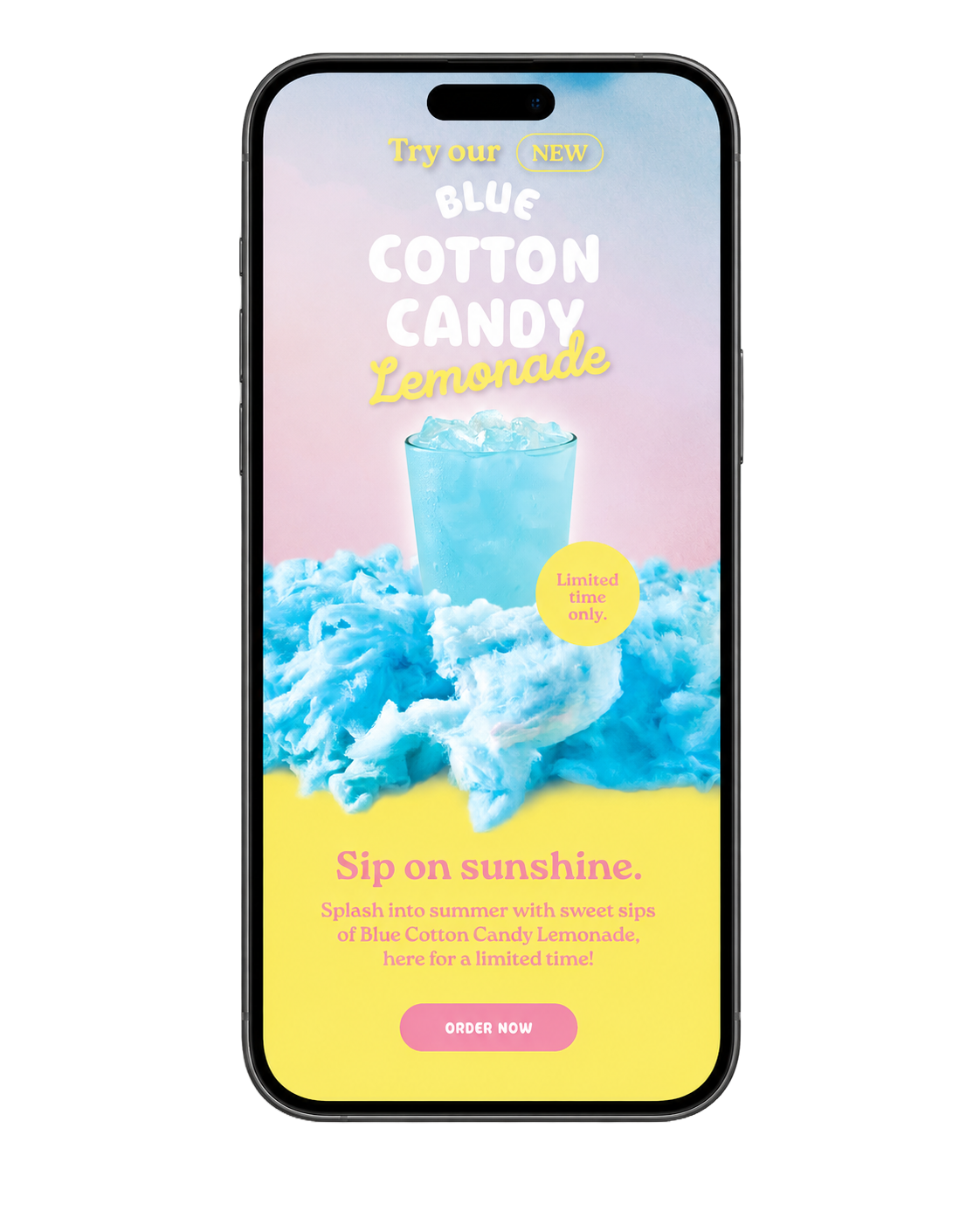
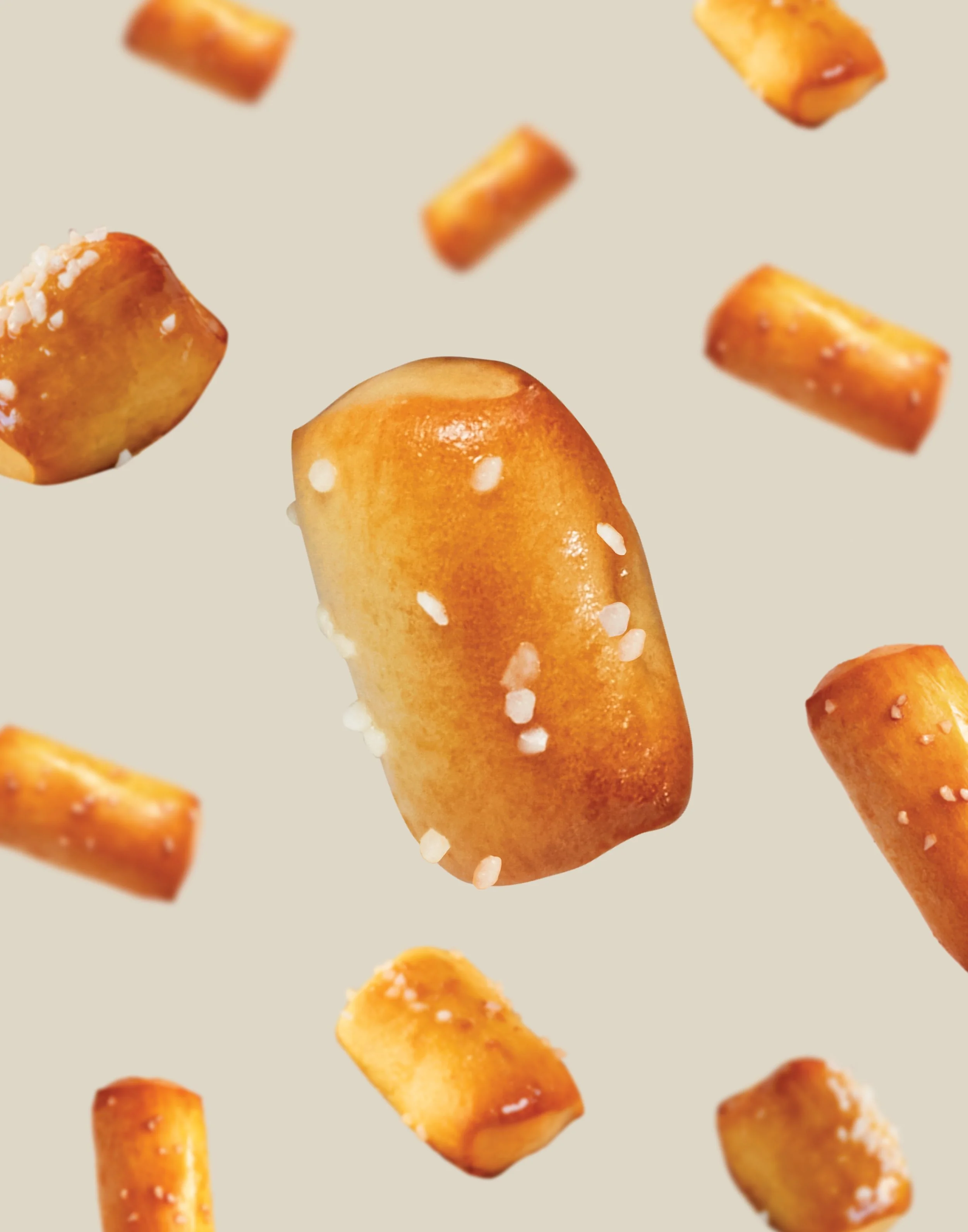
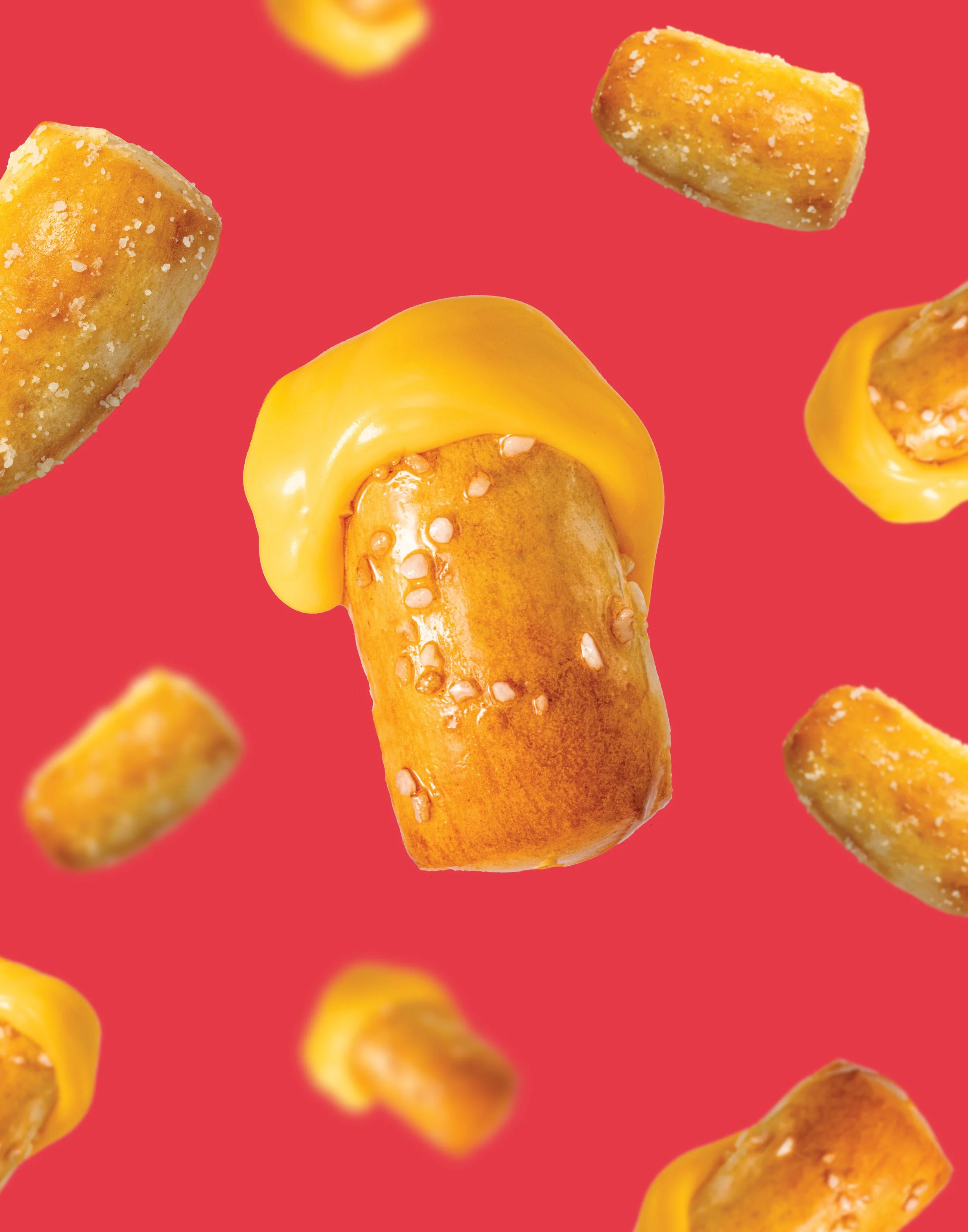
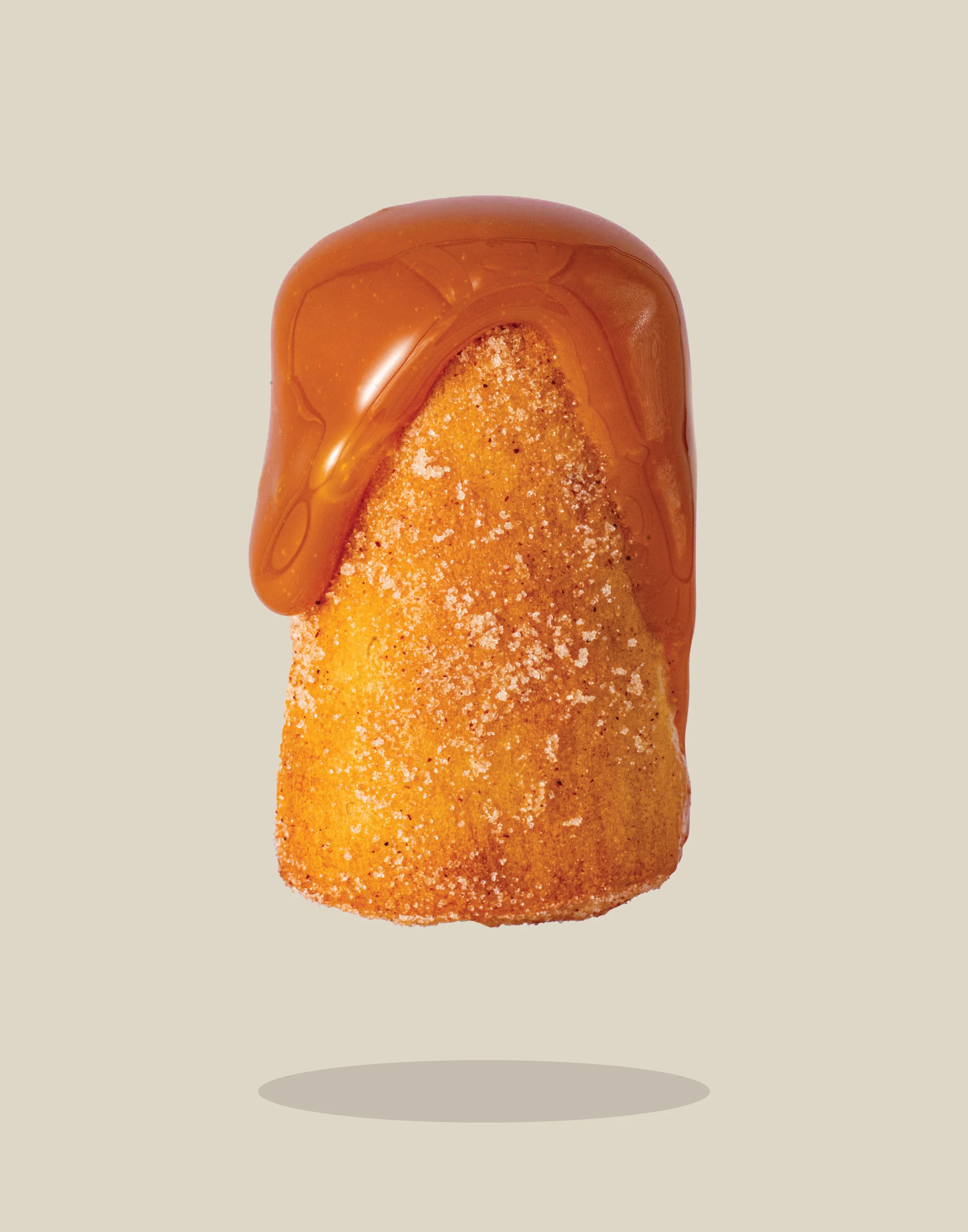
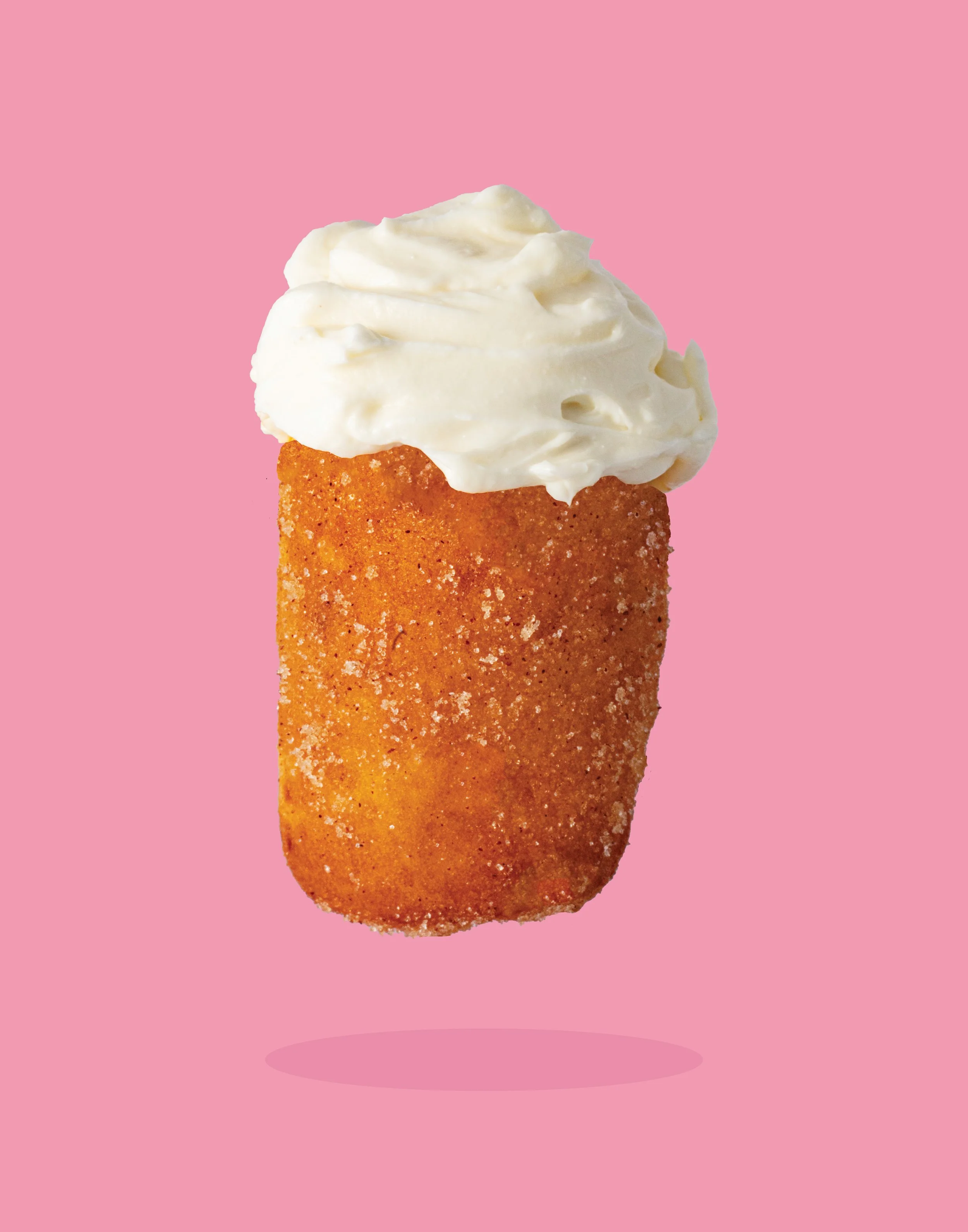
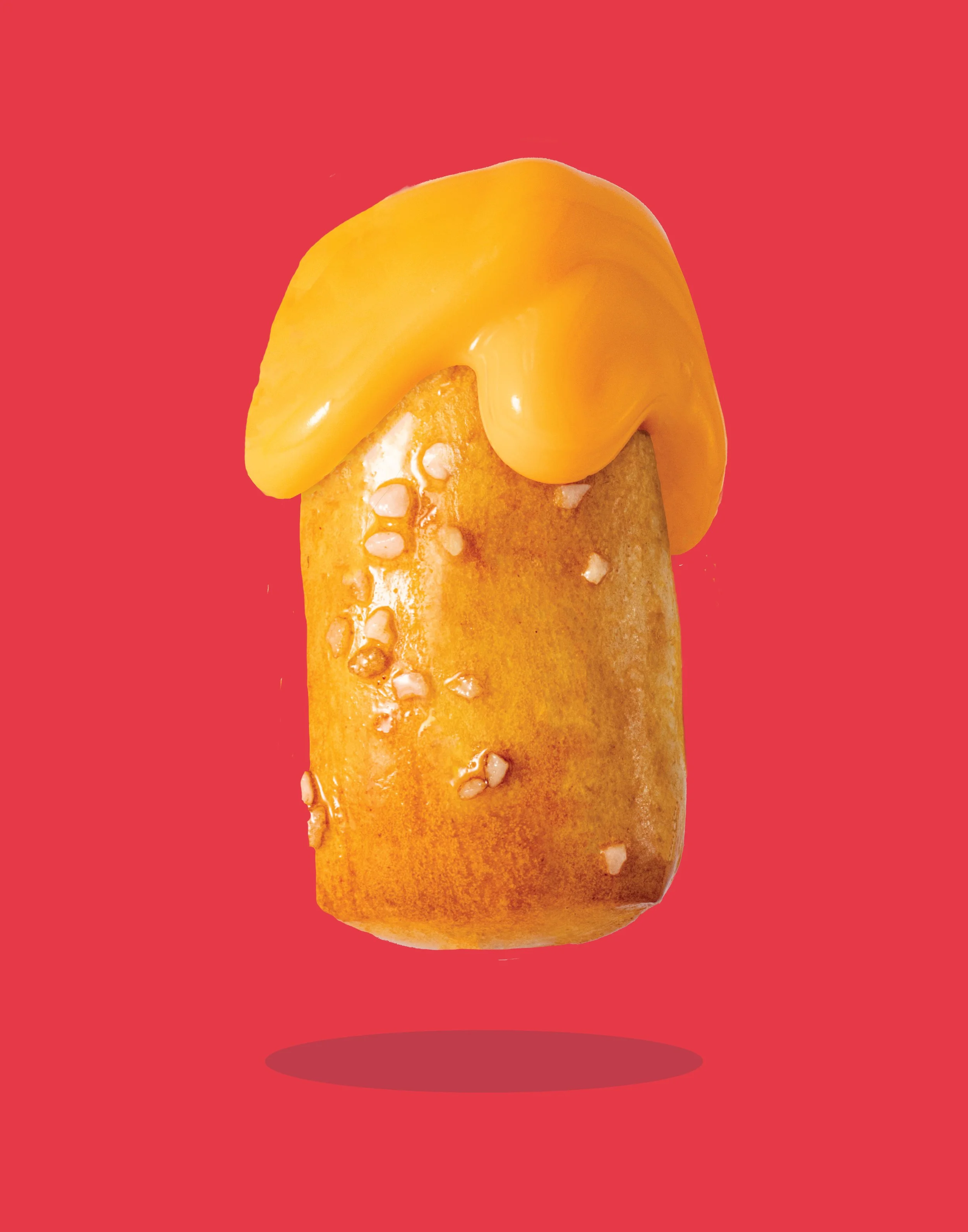
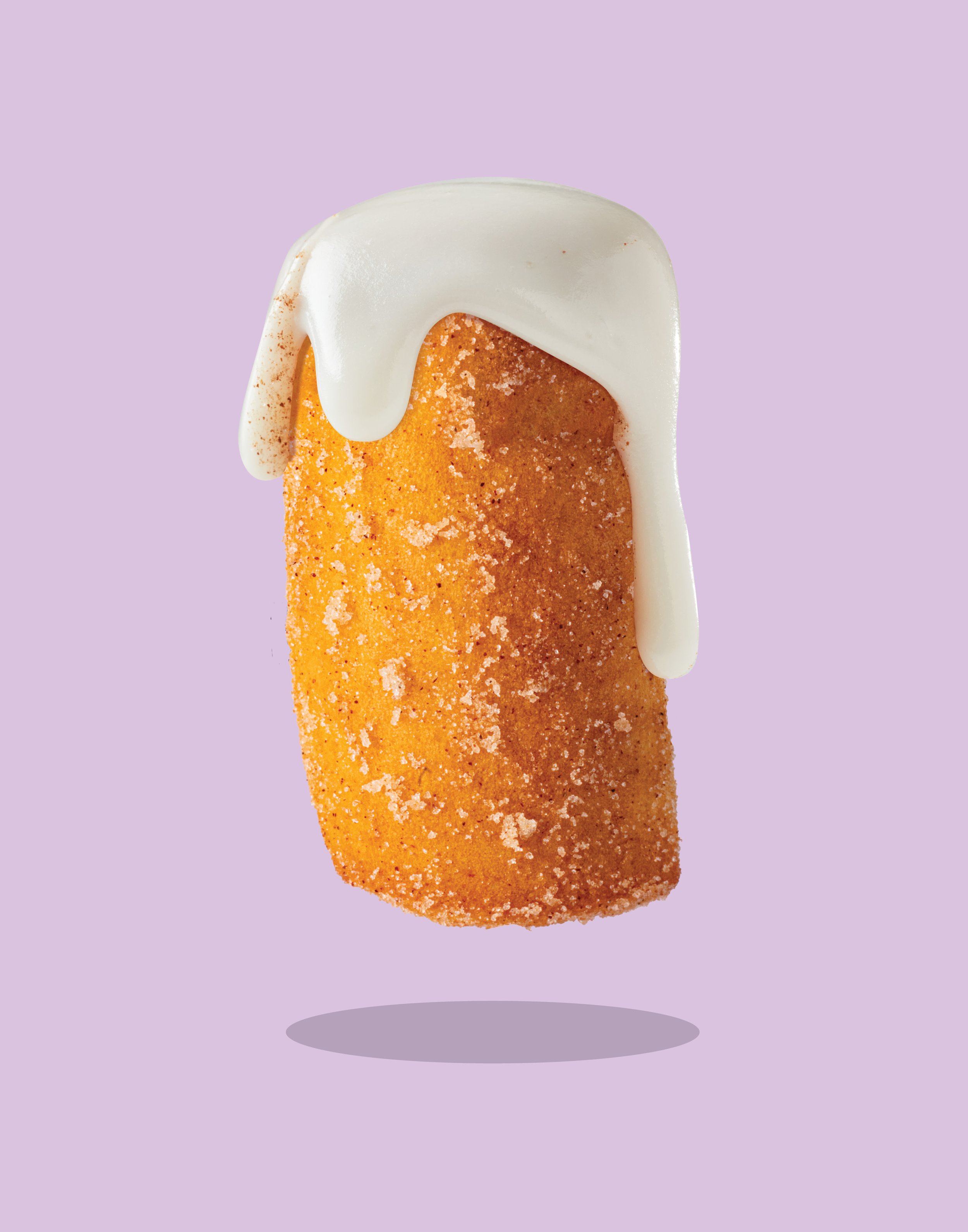
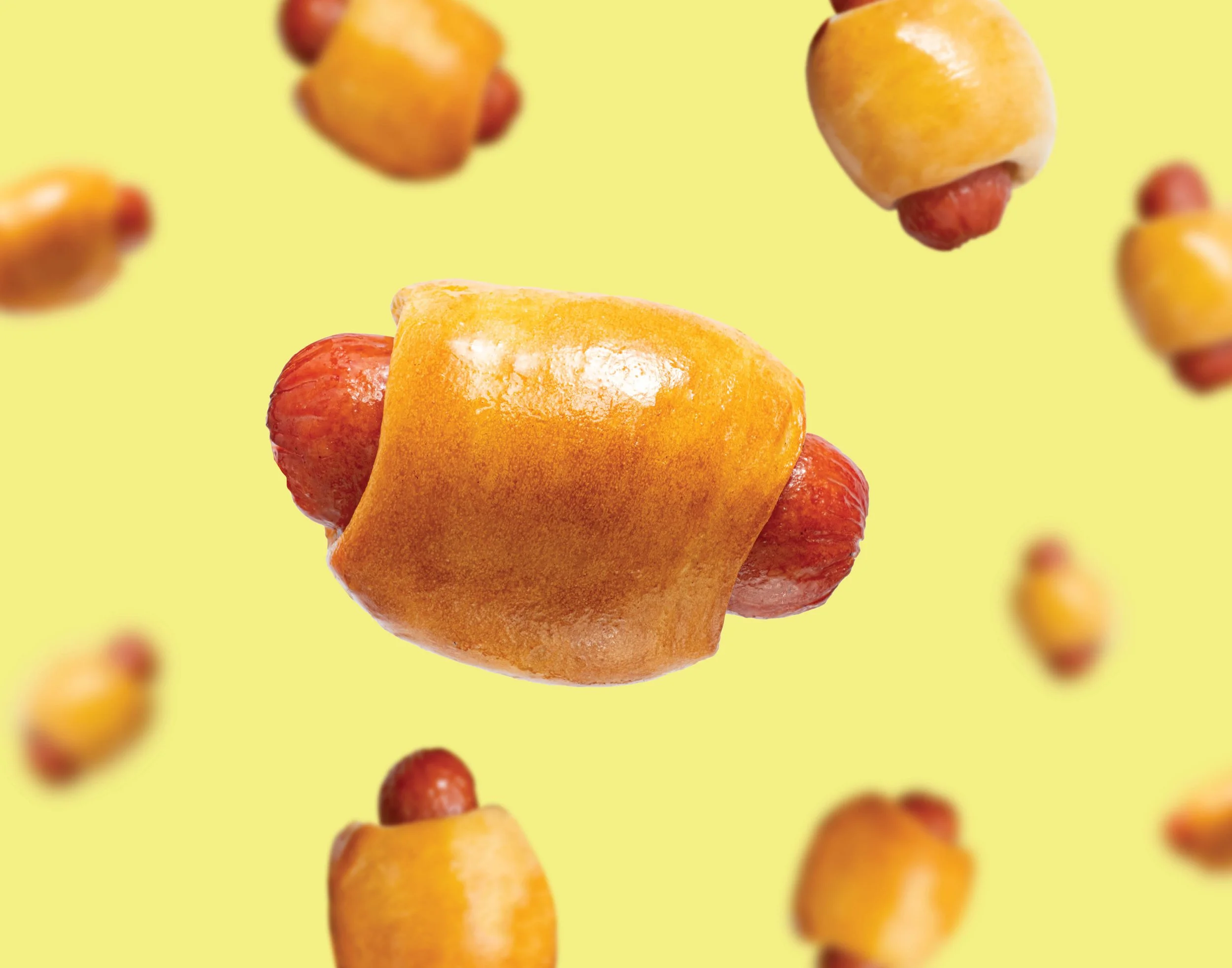
The new identity amplifies Pretzelmaker’s personality through bold color, oversized playful typography, energetic, surreal food photography and unexpected compositions. The resulting system feels youthful and expressive while remaining flexible enough to live across menus, packaging, digital, social, environmental graphics and advertising.